")
3/02/2020
Today’s class was a short class was about showcasing our ideas and layouts . It was a short class but had many discussions and learnings .Where we had to present 5 layouts of the book we were going to make . My all spreads were colorful from rainbow , lavender fresh and deep midnight blues . My stories were more magical and dreamy cities and hence i prefered loud and elaborative colors .
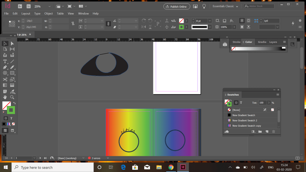
The cover page which i planned to have a eye and neoun outlines and cities behind the eueball as invisible cities that could be only thought of but not seen . Coming to my first layout where through gradient tool i created a rainbow colour where it seems real heavy . In center i created a circle with shape tool and through type on path tool wrote the heading .I specifically increased the stroke size to highlight and differentiate the upcoming picture from the background.
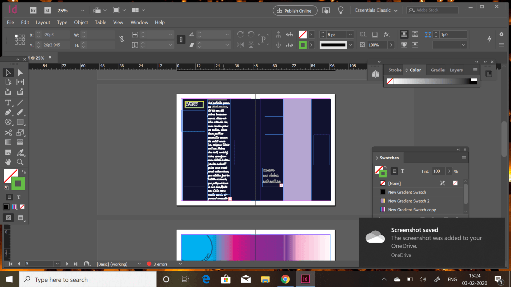
The next layout where i gave the midnight blue and white font to create contrast . In this also i created two versions one with text in the center and pictures on the side and other with text on side in squares . This was to give shapes to everything on the page .I even played with text where i added stroke and fill and the other with only stroke to reduce the chalky feel . For this i even downloaded new text from google fonts to try variations.
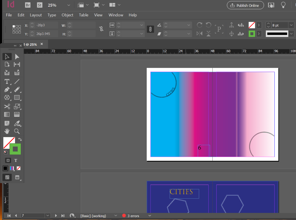
This is a gradient inspired from unicorns . I believe they are most magical imagination. I even created two identical circles and gave a different stroke to enhance the layout .To make the circle accurate to the boders i tried erasing the boders through erasing tool rather than using the scissor tool . It was more of an expirmentation and exporing the most convient way .
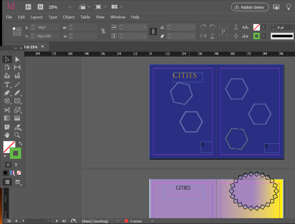
This dark blue layout is inspired from the quote “stars don’t shine until darkness “. Where i created a lighter tone of darkblue and added polygons as a geometrucal form of star . These polygons are frames to put images . Here the city is written in a golden text to uplift the hole shiny concept .
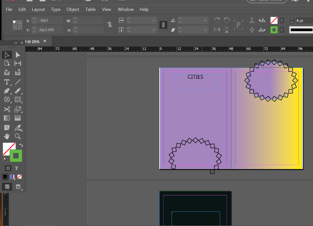
This is the last layout with a flush of summer yellow and the lavender to balance the brightness . Then to explore the image frames i created two semicircles and gave a artistic stroke to add some pattern . The simplicity and elegance of this layout gave me the soothing and creative effect . I even plan on to have a black back cover complementing the cover page .
This class taught many things through discussions and evealuating peer layouts . Where the most important thing that i learnt was ‘Less is more ‘ many times heard but was needed to be applied on my layouts .How to apply page numbers was very new to learn. The simplest layouts also stand out with precise work . These simple leanings helped me alter other projects and give insights to simplicity .
